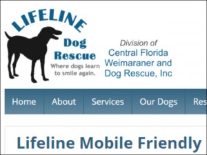
 Another RWD or Responsive Web Design project was launched creating a mobile friendly custom website for Lifeline Dog Rescue.
I created their original website in 2011, yet as technology advanced a makeover was needed to provide a more positive user experience.
Mobile visitors to their site no longer need to scroll or pinch to zoom to view content on their smart phone or other mobile device.
In addition, their phone number and email address are mobile links that may be pressed to instantly call, text, or send an email.
The responsive web design concept within mobile web design is a site that adapts content to a website visitor’s mobile device.
Content does not change by device, but shifts depending on the screen size which is automatically detected in the website code.
A key advantage is there is one design, one set of code, and it adapts to all browsers from smart phone up to desktop monitors.
Lifeline Dog Rescue, a division of Central Florida Weimaraner & Dog Rescue, Inc., is a 501c3 non-profit charitable organization.
Their specialty is breed specific to Weimaraners, yet they do rescue other dogs including mixed breeds. They do amazing work!
Follow the link above to their rwd website, or check out Lifeline Dog Rescue on Facebook.